I
need to start this bulletin with an apology for an error that was pointed out
to me by Roger Smith in New Zealand. In the last bulletin I featured a brain
map which was credited to Nico Lambert. Nico did tweet the image but he never
claimed it was his – the rightful owner/cartographer is a Kiwi, Sam Brown from
Wellington. My apologies to Sam for the mistake.
Roger also sent me a link to a
short video file about New Zealand’s GeoCart Conference held in Auckland a few
months ago. This is a biennial event, which he describes as “always lots of fun
and very rewarding.” Sounds just like a BCS Symposium then! https://www.youtube.com/watch?v=Ig3MlkXKEag
Talking
of the Symposium, next year it will be held jointly with the Society of
Cartographers in York. We have talked about joint events on several occasions
and they have indeed taken place in the past, but this will be the first in
over ten years. Although the exact venue in York is still under discussion we
will be convening from 7th to 9th September, with the 7th
being the Special Interest Group day, followed by two full days of talks, workshops
and the Gala Dinner and Awards Ceremony. There are only four months left before
the Awards close for 2015. So please do enter all the maps you will have
produced between 1st May 2014 and 30th April 2015. The
BCS President’s Annual Golden Ball Golf competition will take place on Thursday
10th September. So for all the budding BCS golfers out there, start
honing your skills in the New Year. You've nine months to perfect your swings
and putts, emulate Rory McIlroy and win the prestigious Golden Ball Trophy!
In
early December, BCS had a stand at GeoDATA London 2014 and it proved to be yet
another excellent event. The stand was busy all day with a steady stream of
visitors and we handled lots of enquiries as well as signing up several new
members. The one theme that persisted all day was a desire for training in
cartography, especially from GIS practitioners, most of whom had never had any
formal cartographic instruction. We are planning to re-launch our ‘Better
Mapping’ workshops in 2015 to try and address this gap in practitioner
knowledge. We are also intending to launch a Local Authority Special Interest
Group in the early part of the year to address their particular needs. So if
you work for a Local Authority and would like to join it or if you have any specific
suggestions and ideas as to what you would like to see covered in it please do
contact me directly in the post Christmas lull as we need your input as soon as
possible.

The
next generation of cartographers (all under 12 years of age) showcased their
talents in Ordnance Survey’s recent competition to design a map of where Santa
lives. Judging by the pictures on their blog they had tens of entries and some
very inventive ways of depicting the theme including paper, computer and Minecraft
worlds! Of course, the prize was a visit to see Santa in Lapland so no wonder
they had so many entries! India, aged 7, from High Wycombe was the lucky
winner. Full
details at https://www.ordnancesurvey.co.uk/blog/2014/12/santa-map-competition-winner/
There
are some exciting developments for 2015 with two major initiatives
planned or underway. The first is a major development with relation to the Cartographic
Journal, which will be available online in the New Year. This reflects the way
that most journals are now circulated but paper copies will still be sent out
to members. Whilst on the subject of the Journal I need to say a big thank you
to Ken Field who has just stood down as editor after 9 years. The Cartographic
Journal has thrived under his editorship and is one of the pre-eminent journals
in the field with authors so keen to be published that we have a lot of
articles awaiting publication.
The
second development is that the Society website is finally undergoing a
major overhaul and between now and its completion I would like to ask for
members to be patient with the 'work in progress' and to remind them that the
Society is staffed by volunteers, without whom it would not exist.
Cartography
on the Internet
As
the fight against Ebola in West Africa goes on, the part that maps have played
in helping to combat the disease is spelt out on the MapAction website,
concentrating on their deployment to Sierra Leone since September. The
MapAction mission was to use their mapping skills to help decision-makers
ensure that adequate treatment facilities were being provided in the right
places and to identify the most effective means of stopping the transmission of
Ebola. This work was supplemented by mapping the number of cases against
building density in Freetown and advising the water and sanitation authorities
where to put fresh water tap stands, something which has echoes of John Snow’s
cholera map of London in the 1800s. Full details of all of the MapAction maps
can be found at http://www.mapaction.org/component/mapcat/georss.html?deployment_filter=232.
 'With
modern satellite technology and GIS capabilities the whole world has now been
mapped'. Actually, no it hasn’t. There are still large swathes of the planet
that have not been mapped, or at least if they have been mapped it is at such a
small scale as to be very limited in use. A recent article on the BBC website
examined some of the reasons why some areas of the world are not well mapped
and whilst some elements of the article are questionable it is an interesting
piece. It also mentions the ‘Missing Maps’ project, an initiative to map the most vulnerable places in the
developing world, in order that international and local NGOs, and individuals
can use the maps and data to better respond to crises affecting the areas.
Based on the Open Street Map concept, anyone can join in to add detail to those
parts of the world where mapping can make a huge contribution to disaster
relief efforts and humanitarian projects. The image shows a group of
contributors at a ‘Missing Maps Party’, a wonderful example of collaborative
cartography.
Perhaps
we should be asking if our planet is even the best mapped in the Solar System
as USGS has just announced the creation of
its most detailed map yet of Mars.

Whilst
I fully appreciate that the London Underground Map has been much abused and
parodied with all sorts of topics being fitted to its network, there is a
recent one which I think really works and is actually useful and interesting.
LONDONIST have produced a medieval tube map, favouring Domesday Book names
primarily to show what would have been at the stations hundreds of years ago.
Many names are recognisable even if in a slightly different form and it is
interesting to see how big London was at the time and how so many of the
outlying villages have since been swallowed up in the urban sprawl. As the site
notes, they have omitted the Docklands Light Railway as most names would have
simply been a variation on ‘marshland’.
Staying
with London, the picture shows plans for a redevelopment of Charing Cross
bridge to remove

ICA
Map Carte
A
curtailed selection this month, as there are 7 more maps to come in December.
Perhaps India's Santa Map should feature on 25th December? My first
selection is the 'National Geographic Atlas', which I was going to call a
timeless classic, but then it has only been around since the 1960s, so is it
still a little early to earn the description? Whether it is or not, it remains
a great example of clear and simple cartography and a ‘house style’ that is
instantly recognisable.


My
second selection is William Smith’s 'Geological Map of England and Wales and
parts of Scotland'. It is the subject of Simon Winchester’s book, ‘The Map That
Changed the World’ and which I can thoroughly recommend as a good read. Having
seen the full-sized map by William Smith at the Geological Society of London’s
offices, it is a truly awe-inspiring map in its complexity as well as its
simplicity. Can you have something that is both complex and simple? Well, I would
argue that you can in this instance. 'Complex' in the nature of the subject
that he was studying, yet 'simple' in the layout and depiction, which thus
renders the underlying details with remarkable clarity.
 My
final abbreviated selection is the 'First World War Trench Map of Guedecort',
although any one of the extensive series could have been chosen. Setting out to
war with old and unsuitable maps at a variety of scales, British troops very soon
came to rely on the new 1:10 000 series of maps that eventually covered the
whole of the Western Front. Using conventional survey techniques and
incorporating detail taken from aerial photography, these maps were updated on a
very regular basis to ensure that the latest military situation could be
communicated rapidly. Under the conditions at the time it is amazing to think
of Field Survey Companies producing and printing maps in the field of such a
standard and in such great quantities. Incidentally, a set of 7 commemorative
map reproductions, originally produced for the 90th Anniversary of
the First Battle of the Somme, are still available at a very reasonable sum
indeed. Contact me for details using the addresses at the foot of the Bulletin.
And
finally
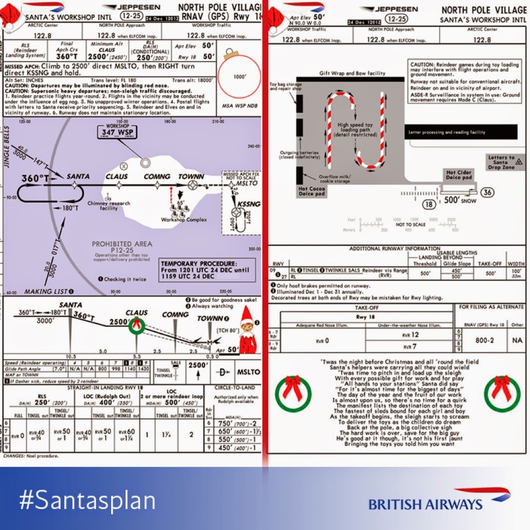
Jeppesens
have been planning ahead and it looks as though Santa has been cleared to land.
I
know that I posted this a couple of years ago, but thought that it was time for
a reminder that you can keep track of Santa as he delivers gifts around the
world. NORAD’s sophisticated tracking system follows him on his journey and if
you want to make sure that you are tucked up and asleep before he arrives,
check out http://www.noradsanta.org/
for his progress.
Very
Best Wishes for Christmas and the New Year.
Pete Jones MBE FBCart.S CGeog
24th December 2014
E-mail: peter.jones991@mod.uk
Twitter: @geomapnut


